Statistics
Introduction
Statistics is the discipline that concerns the collection, organization,
displaying, analysis, interpretation and presentation of data.
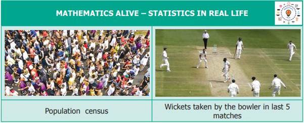
Necessity of collecting Data
Data
means, "Facts or figures from which conclusions can be drawn". Data
is collected, measured and analysed, whereupon it can be visualized using
graphs or images. The data could consist of information like the ration card
number with address, the name of the student, Aadhaar card identity number,
date of birth, phone number for communication etc., these are preserved for
drawing inferences.

Data
In
our daily life, we come across many situations where we need to collect
information in the form of Facts or Numbers.
For example,
Ø Number
of students in your class using calculators.
Ø Number
of brothers and sisters in your family.
Ø Number
of different types of houses in a village.
Ø Number
of girls wearing bangles.
Ø Number
of buses crossing a certain road junction at a particular time.
Ø Number
of persons in a street who watch T.V. for more than 2 hours a day.
Ø Number
of shops in a shopping mall selling textiles.
Ø Speeds
of bikes, cars and other vehicles passed along a specific highway.
Ø Thus,
the numerical information or facts collected are known as Data.
Data
collection
Data collection is the process of gathering and measuring information
on targeted variables in an established system, which then enables one to
answer relevant questions and evaluate outcomes.
For example,
Santhi
collected the following information about her friend's preference of sweets
which is as shown below.
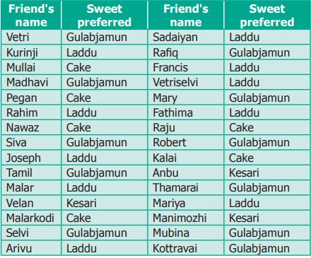
This way of collecting the data helps Santhi to
decide, what sweets to get for her birthday and how much for each.
Types of Data
On
the basis of collection, data are of two types. They are primary data and
secondary data.
Primary data
Primary
data means the raw data (not tailored data) which has just been collected from
the original source and has not gone any kind of statistical treatment like sorting
and tabulation.
Examples
Ø List
of absentees in the class.
Ø A
survey on writing habits of students conducted by a pen manufacturing company.
Ø The
types of leaves collected by students for studying nature.
Secondary Data
Secondary data consists of second
hand information which has already been collected. It could have been collected
by someone other than the user, for some other purpose.
Examples
Ø The
Headmaster collects the students’ absentee list from school office.
Ø Cricket
scores gathered from a website.
Ø Data
from Television and Newspapers.
Ø List
of contact numbers from telephone directory.
Organizing Data
The collected data are to be
arranged methodically or logically so that the information can be looked up
fast whenever needed, easily and efficiently. The method of organizing the data
is discussed as follows.
I.
Tally Marks
Tally
marks, also called hash marks, are a unary numeral system.
They are a form of numeral used for counting. They are most useful in counting
or tallying ongoing
results, such as the score in a game or sport, as no intermediate results need
to be erased or discarded.
For example, can any one
quickly tell the number of people who do not like Laddu, Kesari, Gulabjamun, and
Cake? From below table

Use ‘![]() ’
marks to note down how many friends like each of the sweets. The count of each
sweet is called as “Frequency”.
’
marks to note down how many friends like each of the sweets. The count of each
sweet is called as “Frequency”.
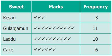
We can arrange the same data as
shown below.
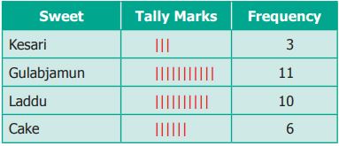
Both have done well. But one
would prefer tally marks as they are very simple.

So, we can arrange the same
data as shown below.
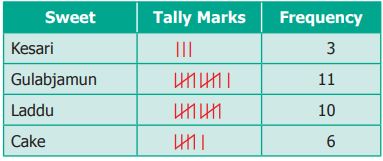
The standard form of
representing the data is got by using ‘Tally marks’.
Ø The
occurrence of each information is marked by a vertical line ‘a’.
Ø Every
fifth tally is recorded by striking through the previous four vertical lines as
‘![]() ’.
’.
Ø This
makes counting up the tallies easy.
Example
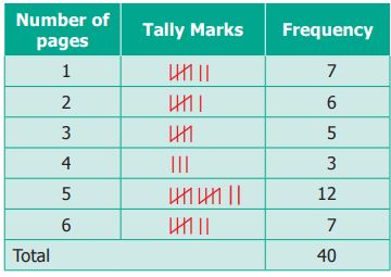
Thamarai is fond of reading books. The number of
pages read by her on each day during the last 40 days are given below. Make a
Tally Marks table.

Solution
The Tally marks table is given below.
Representation of data using Pictograph
A
pictograph is the representation of data through pictures.
For example, Azhagi drew the pictures of the
vehicles that she had seen, as shown below.

Azhagi had seen 5 cars, 3 Lorries and 2 buses.
This sort of representation of data using
pictures is called Pictograph.
Nowadays
pictographs are frequently used in promotion of tourism, weather forecast,
geography etc.
Advantages of using Pictograph
Ø The
data can be easily analysed and interpreted.
Ø The
pictures and symbols help us to understand better.
Ø The
pictograph is a pictorial representation for a word or Phrase.
Ø A
pictograph is also called Pictogram.
Ø Pictographs
were used as the earliest known form of writing examples having been discovered
in Egypt and Mesopotomia since 3000 BC.
Need for scaling in the Pictograph
For
example, a fruit stall where there are 40 mangoes, 55 apples, 35 oranges and 60
bananas. How can we represent this data by using pictures? If the data is very
large, it is very difficult and time consuming to represent each of the fruits
in a pictograph. In such cases, we can use one picture to represent many of the
same kind. This is called scaling.

Drawing Pictographs
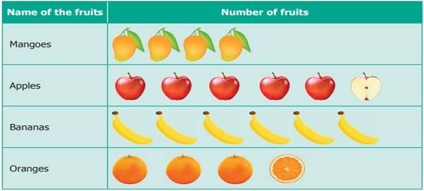
Consider
the above data of fruits. 40 and 60 are multiples of 10, while 55 and 35 are
multiples of 5. Let us assume, that one full picture of fruit represents 10
fruits and One half picture represents 5fruits. The pictograph can be drawn for
the above data as shown below.
Interpreting pictograph
From the above pictograph the number of fruits
can be calculated very easily.
Ø Number
of Mangoes = 4 full pictures= 4 × 10 = 40 mangoes
Ø Number
of Apples = 5 full pictures and 1 half picture= (5 x 10) + 5 = 55 apples
Ø Number
of Bananas = 6 full pictures 6 × 10 = 60 bananas
Ø Number
of Oranges = 3 full pictures and 1 half picture = (3 x 10) + 5 = 35 oranges.
Example
The following table shows the number of vehicles
sold in a year
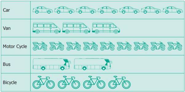
Look at the pictograph and answer the following
questions.
(i)
How many motor cycles were sold
in a year?
(ii)
Number of buses sold in a year
is 20. Say True or False.
(iii)
How many bicycles were sold?
(iv)
How many cars and vans were sold?
(v)
How many vehicles were sold altogether?
Solution
Given: 1 picture represents 10 vehicles
(i)
There were 9 × 10 = 90 motor
cycles sold.
(ii)
True.
(iii)
There were 4 × 10 = 40 bicycles
sold.
(iv)
There were 7 cars and 3 vans
pictures. Therefore 70 + 30 = 100 cars and vans sold.
(v)
There were 7 cars, 3 vans, 9
motor cycles, 2 buses and 4 bicycles sold. Therefore, 70 + 30 + 90 + 20 + 40 =
250 vehicles sold.
Example
The pictograph shows the
number of branded mobile phones sold in five months.
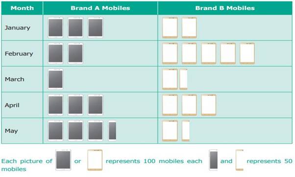
Observe
the given table and answer the following questions.
(i)
In
which month was the maximum number of brand B mobiles sold?
(ii)
In
which month was equal number of brand A and brand B mobiles sold?
(iii)
In
which month was the minimum number of brand a mobiles sold?
(iv)
Find
the total number of Brand A Mobiles that were sold in
5 months.
(v)
What
is the difference between the sale of brand A and brand B Mobiles in the month
of May?
Solution
(i)
February
(ii)
April
(iii)
March
(iv)
1250
(v)
Brand A has sold 200 mobiles
more than brand B
Representation of data using Bar Graph
A Bar graph consists of equally -
spaced parallel bars (Horizontal or Vertical) whose lengths / heights are
proportional to the number of items given.
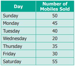
For example, Ragavi’s father is a mobile shop
owner. She finds the following data of sale of mobiles in a week.
Drawing Bar-Graph
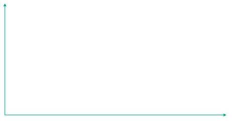
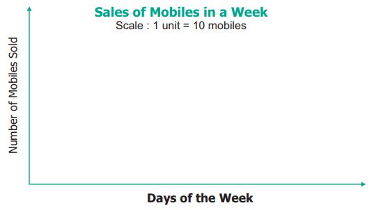
Step 1. Draw two lines which are perpendicular
to each other. One of them is horizontal and the other one is vertical.
Step 2. A suitable title (Sale of mobiles in a week) is
given. The lines are labelled (Horizontal line![]() Days of the week; vertical line
Days of the week; vertical line ![]() Number of mobiles sold).
Number of mobiles sold).
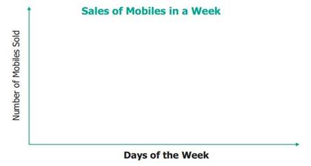
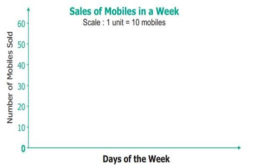
Step 3. A suitable scale is chosen. The scale
used is stated on the graph.
Step 4. Let the vertical line start from 0 and
the values of information are marked at equal distances in same increments.
Step 5.
For each information vertical bars are drawn on the horizontal line. They are
labelled by respective information (as Monday, Tuesday… Sunday).
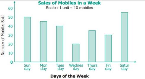
This graph is called as Vertical Bar Graph.
The corresponding horizontal Bar Graph will look
like this:
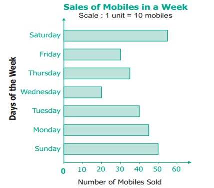
Interpreting the Bar Graph
The data from the below Bar Graph can be easily
interpreted and analysed as follows.
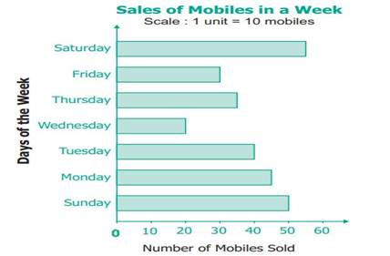
Ø The
maximum number of mobiles were sold on Sunday (55).
Ø The
minimum number of mobiles were sold on Thursday (20).
Ø The
total number of mobiles sold in the week (50+45+40+20+35+30+55 = 275).
Ø The
number of mobiles sold on a particular day (for example: on Friday is 35,
etc.,).
Example
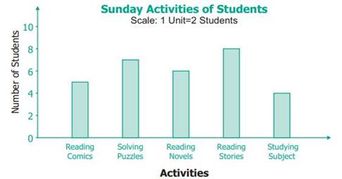
Study the above Bar graph and answer the
following questions.
(i)
Which activity is followed by
maximum number of students?
(ii)
How many students in all, spend
their time on solving puzzles?
(iii)
The total number of students
who follow either reading stories or reading their subjects is __________.
(iv)
The activity followed by
minimum number of students is __________.
(v)
The number of students who took
part in reading comics is __________.
Solution
(i)
‘Reading stories’ is followed
by maximum number of students.
(ii)
7 students spend their time to
work out solving puzzles.
(iii)
8 + 4 = 12 students spend their time on
reading.
(iv)
‘Studying subject’ is followed
by minimum number of students.
(v)
5 students spend their time on
reading comics.
Summary
Ø Information
collected is known as data.
Ø First-hand
information is called primary data.
Ø The
data collected by someone else is called secondary data.
Ø The
data collected is organized usually in a tally marks table.
Ø The
organized data can be represented using a pictograph or a bar graph.
Ø A pictograph is the representation of data
through pictures of objects.
Ø A
bar graph consists of parallel bars (horizontal or vertical) whose length
corresponds to the number of items.
Ø The
pictographs and the bar graphs are interpreted to answer the questions on data.