STATISTICS
1 Data:
Data is the basic unit
in Statistics. Data is a collection of facts such as numbers, words,
measurements and observations. It must be organised, for it to be useful and to
get information. Data can be collected in many ways. Among all the ways, direct
observation is one of the simplest way to collect the data.
For example, if you want
to find the number of types of houses in a village, You
can count the types of houses in the village, in person similarly,
(i)
Collection of brand wise
motorcycles in your place.
Brand A – 25, Brand B – 40, Brand,
C –14 and Brand D – 37
(ii)
Collection of term marks in
Mathematics of your class mates.
39, 20, 19, 47, 50, 26, 35, 40, 17, 25, 41.
(iii)
Number of students playing
different sports from your class.
Volley ball –12 Kabaddi – 10
Hockey – 9 Cricket – 7 Badminton – 7
(iv)
Staff ’s age in a company
27,
51, 19, 21, 46, 35, 52, 25, 57, 29.
The
above facts are some more examples for data,
Let us now see the kinds
of data. There are two kinds of data namely primary data and secondary data.
Primary data:
These are the data that
are collected in person for the first time for a specific purpose. Here, Kamaraj has collected the data of math marks from the
students in person. It is called primary data.
Also, (i) Census in a
village
(ii)
Collection of colours which the students like in a class are some examples of
primary data.
Secondary data:
These are the data that
are sourced from some places that has originally collected it. This kind of
data has already been collected by some other persons. The statistical
operation may have been performed on them already. Here, Geetha
also collected the data but she took it from a record which had already
collected them. This is called secondary data.
Also, (i) The details of 'PATTA' for a land can be had from the
registration office.
(ii)
Birth–Death details data can be got from concern office are some examples of
secondary data.
2.Data in Tabular form
To make the given data
easily understandable, we tabulate the data in the form of tables or charts. A
table has three columns that contains
(i)Variable /Class (ii)
Tally Marks (iii)
Frequency
Variable / Class:
Arrange the given data
from the lowest to the highest in the first column under the heading variable
or class.
Tally Marks:
A vertical line(|) which is marked against each item falling in the
variable /class is called tally marks.
Frequency:
The number of times an
observation occurs in the given data is called the frequency of the
observation. This is easily counted from the tally marks column.
For
example:
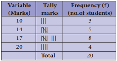
From the table, we understand that three
students got 10 marks, five students got 14 marks and so on.
Ungrouped data or Discrete Data:
An ungrouped data can
assume only whole numbers and exact measurement. These are the data that cannot
have a range of values. A usual way to represent this is by using Bar graphs
Examples: 1. The number of
teachers in a school.
2. The number
of players in a game.
Grouped data or Continuous Data:
A grouped data is any
value within a certain interval. The data can take values between certain range
with the highest and the lowest value. Continuous data can be tabulated in what
is called as frequency distribution. They can be graphically represented using Histograms.
Example: 1. The age of persons in a village.
2. The height
and the weight of the students of your class.
3 Frequency distribution table
Frequency distribution:
A frequency distribution
is the arrangement of the given data in the form of the table showing frequency
with which each variable occurs.
If we have more number
of students in the class , it would be very difficult
to understand and to get information unless it is organised. For this reason,
we organise larger data into a table called the frequency distribution table.
Therefore, the tabular arrangement which shows the observations and their
frequency of occurrences is called the frequency distribution table. There are
two types of distribution table namely
(i)
frequency distribution table
for ungrouped data and
(ii)
frequency
distribution table for grouped data.
3.1 Construction of frequency distribution table for ungrouped
data.
Example
1 Form an ungrouped frequency distribution table
for the weight of 25 students in STD IV given below and answer the following
questions.
25, 24, 20, 25, 16, 15,
18, 20, 25, 16, 20, 16, 15, 18, 25, 16, 24, 18, 25, 15, 27, 20, 20, 27, 25.
(i)
Find the range of the weights.
(ii)
How many of the students has
the highest weight in the class?
(iii)
What is the weight to which
more number of students belong to?
(iv)
How many of them belong to the
least weight?
Solution:
To form a distribution
table, arrange the given data in ascending order under Weight column then, put
a vertical mark against each variable under Tally marks column and count the
number of tally marks against the variable and enter it in Frequency column as
given below. Hence, the distribution table is
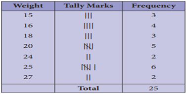
Thus, we can tabulate
the above table as follows.

(i)
The range of the given data is
the difference between the largest and the smallest value. Here, the range =
27–15 =12.
(ii)
From this table, two of the
students have the highest weight of 27 kg.
(iii)
6 students belong to 25 kg
weight.
(iv)
3 students belong to the least
weight of 15 kg.
3.2 Construction of frequency distribution table for grouped
data:
Now, we will consider a
situation, if we collect data of marks for 50 students, it becomes very
difficult to put tally for each and every marks of all the 50 students. Because
if we arrange the marks in a table, it will be very large in length and not
understandable at once. In this case, we use class intervals. In this table,
consider the groups of data in the form of class intervals to tally the
frequency for the given data.
Class Interval:
The range of the
variable is grouped into number of classes, and each group is known as class interval (C.I). The difference
between the upper limit (U) and the lower limit (L) of the class is known as class size. i.e. C.I = Upper limit – Lower limit
For
example,
Marks for the C.I 10 to
20 can be written as 10-20, whose class size is 20–10=10
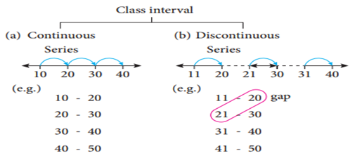
(a) While
distributing the frequency, we follow the counting as given below. Suppose the
classes are 10-20, 20-30, 30-40, 40-50 ..... This
represent a continuous series. Here, 20 is included in the class 20-30 and 30
is included in 30-40, likewise for the other classes also.
(b)
In case the given series has a
gap between the limits of any two adjacent classes, this gap may be filled up
by extending the two limits of each class by taking half of the value of the
gap. Half of the gap is called the adjustment factor.
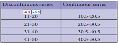
Conversion of a discontinuous series into continuous series:
In case the given series is a discontinuous, we can
make it as continuous as follows,
Illustration:
1
 11 -
20 gap difference in the gap = 21 – 20=1
21
- 30
31
- 40
41
- 50
Lower boundary = lower limit –half of the gap
![]()
![]()
Upper boundary = upper limit + half of the gap

![]()
Therefore, the class interval can be changed
into a continuous one as given in the following table,
(i).Construction of grouped frequency
distribution table – Continuous series.
Example
2 The EB bill (in ₹)
of each of the 26 houses in a village are given below. Construct the frequency
table.

Solution:
Maximum bill amount = ₹800
Minimum bill amount = ₹120
Range = maximum value –
minimum value Range = 800 – 120 = ₹680
Suppose if we want to
take class size as 100, then the

![]()

(ii).Construction of grouped frequency distribution table -
Discontinuous series.
Example
3 Construct a continuous series frequency
distribution table.

Solution:
As told above, first we
should fill the gap by extending the two limits of each class by half of the
value of the gap. Here the gap is 1, so subtracting and adding half of the gap i.e 0.5 to the lower and the upper limit of each
class makes it as a continuous series.

4.Graphical representation of the frequency distribution
for ungrouped data
A graphical
representation is the geometrical image of a set of data. It is a mathematical
picture. It enables us to think about a statistical problem in visual terms. A
picture is said to be more effective than words for describing a particular
thing. The graphical representation of data is more effective for
understanding. Now, we are going to represent the given ungrouped data in the
circular form namely the pie diagram or the pie chart.
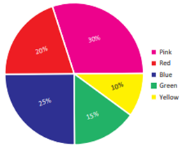
5 Pie chart (or) Pie diagram
A pie chart is a
circular graph which shows the total value with its components. The area of a
circle represents the total value and the different sectors of the circle
represent the different components. The circle is divided into sectors and the
area of the sectors is proportional to the information given. In the ‘pie
chart’ the data are mostly expressed in percentage. Each component is expressed
as percentage of the total value.
The Pie diagram is so
called because the entire graph looks like an American food ‘pie’ and the
components resemble slices cut from ‘pie’.
Example
5.1 Method of constructing a pie chart:
In a pie chart, we know
that the various components are represented by the sectors of a circle and the
whole circle represents the sum of the value of all the components. Therefore,
the total angle of 360° at the centre of the circle is divided into different sectors
according to the value of the components.
The central angle of a component ![]()
Sometimes, the value of
the components are expressed in percentage. In such cases,
The central angle of a component ![]()
Steps
for construction of the pie chart:
1)
Calculate the central angle for
each component using the above formula and tabulate it.
2)
Draw a circle of convenient
radius and mark one horizontal radius in it.
3)
Draw radius making central
angle of first component with horizontal radius. This sector represents the
first component. From this radius, draw next radius with central angle of the
second component and so on, until the completion of all components.
4)
For identification of each
sector, shade with different colours.
5)
Label each sector.
Here are given some
examples, let us draw the pie chart for the given data.
Example
4 The number of hours spent by a school student
on various activities on a working day is given below. Construct a pie chart.

1.
Find the percentage of sleeping
hours.
2.
By what angle is home work more
than play?
3.
By what angle are other
activities less than sleep?
Solution:
Number of hours spent in
different activities in a day of 24 hours are converted into components parts
of 360°.
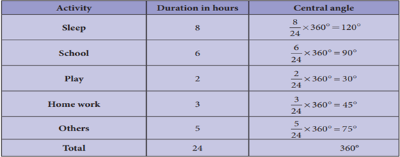
The time spent by a
school student during a day (24 hours)
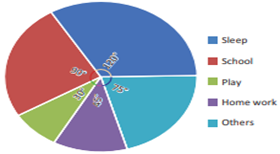
1.
The percentage of sleeping
hours = ![]() × 100 = 33.33%
× 100 = 33.33%
2.
Home work is 45°–30°=15° more
than play
3.
Other activities are
120°–75°=45° less than sleep.
6 Graphical representation of the frequency distribution for
grouped data
The Line graph, Bar
graph, Pictograph and the Pie chart are the graphical representations of the
frequency distribution for ungrouped data. Histogram, Frequency polygon,
Frequency curve, Cumulative frequency curves (Ogives)
are some of the graphical representations of the frequency distribution for
grouped data.
In this class, we are
going to represent the grouped data frequency by Histogram and Frequency
polygon only. You will learn the other type of representations in the higher
classes.

7 Histogram
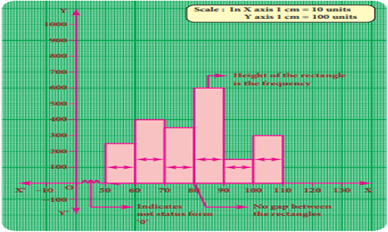
A histogram is a graph
of a continuous frequency distribution. Histogram contains a set of rectangles,
the base of which is the length of the class interval and the frequency in each
class interval is its height. i.e
the class intervals are represented on the horizontal axis (x- axis) and the
frequencies are represented on the vertical axis (y-axis).
The area of each
rectangle is proportional to the frequency in the respective class interval and
the total area of the histogram is proportional to the total frequency. Because
of the continuous frequency distribution, the rectangles are placed
continuously side by side with no gap between adjacent rectangles.
Steps to construct a Histogram:
1.
Represent the data in the
continuous form (exclusive form) if it is in discontinuous form (inclusive
form) by converting it using the adjustment factor.
2.
Select the appropriate units
along the x-axis and y-axis.
3.
Plot the lower limits of all
class interval on the x –axis.
4.
Plot the frequencies of the
distribution on the y – axis.
5.
Construct the rectangles with
class intervals as bases and corresponding frequencies as heights. Each class
has lower and upper values. This gives us two equal vertical lines representing
the frequencies. The upper ends of the lines are joined together and this
process will give us rectangles.
7.1 Construction of a histogram for continuous frequency
distribution:
Example
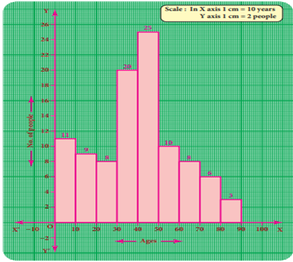
5 Draw a histogram for the following table which
represents the age groups from 100 people in a village.

Solution:
The given data is a
continuous frequency distribution. The class intervals are drawn on x-axis and
their respective frequencies on y-axis. Classes (ages) and its frequencies
(number of people) are taken together to form a rectangle.
The histogram is
constructed as given below
7.2 Construction of histogram for discontinuous frequency
distribution:
Example
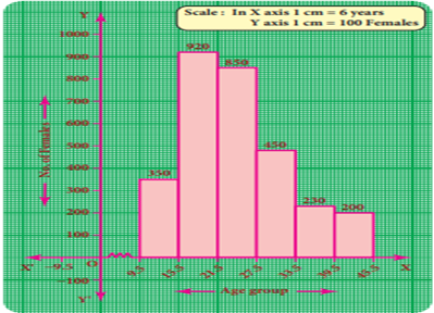
6 The following table gives the number of
literate females in the age group 10 to 45 years in a town.

Draw a
histogram to represent the above data
Solution:
The given distribution
is discontinuous. If we represent the given data as it is by a graph we shall
get a bar graph, as there will be gaps in between the classes. So, convert this
into a continuous distribution using the adjustment factor .
That is, lower boundary
= lower limit ![]()

![]()
Upper
boundary = upper limit![]()

![]()
The first class interval
can be written as 9.5-15.5 and the remaining class intervals are changed in the
same way. There are no changes in frequencies.
The new continuous
frequency table is

The histogram is
constructed as below
8 Frequency Polygon
A frequency polygon is a
line graph for the graphical representation of the frequency distribution. If
we mark the midpoints on the top of the rectangles in a histogram and join them
by straight lines, the figure so formed is called a frequency polygon. It is called a polygon as it consists of a
number of lines as the sides of a polygon.
A frequency polygon is
useful in comparing two or more frequency distributions. A frequency polygon
for a grouped frequency distribution can be constructed in two ways.
i)
Using a histogram
ii)
Without using a histogram
8.1 To construct a frequency polygon using a histogram:
1.
Draw a histogram from the given
data.
2.
Join the consecutive midpoints
of the upper sides of the adjacent rectangles of the histogram by the line
segments.
3.
It is assumed that the class
interval preceding the first rectangle and the class interval succeeding the
last rectangle exists in the histogram and the frequency of each extreme class
interval is zero. These class intervals are known as imagined class intervals.
4.
To get frequency polygon, join
the midpoints of these imagined classes with the corresponding midpoints of the
upper sides of the first and last rectangles of the histogram.
Example
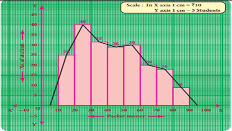
7 The following is the distribution of pocket
money of 200 students in a school.

Draw a
frequency polygon using histogram.
Solution:
Represent the pocket
money along x- axis and number of students along the y–axis.
Draw a histogram for the
given data. Now, mark the midpoints of the upper sides of the consecutive rectangles.
Also mark the midpoints of two imagined class intervals 0-10 and 90-100 whose
frequency is 0 on x- axis. Now, join all the midpoints with the help of ruler.
We get a frequency polygon imposed on the histogram.
8.2 To draw a frequency polygon without using a histogram:
(1) Find the midpoints
of the class intervals and tabulate it.
(2) Mark the midpoints
of the class intervals on x-axis and frequencies on y-axis.
(3) Plot the points
corresponding to the frequencies at each midpoints.
(4) Join the points
using a ruler, to get the frequency polygon.
Example
8 Draw a frequency polygon for the following data
without using histogram.

Solution:
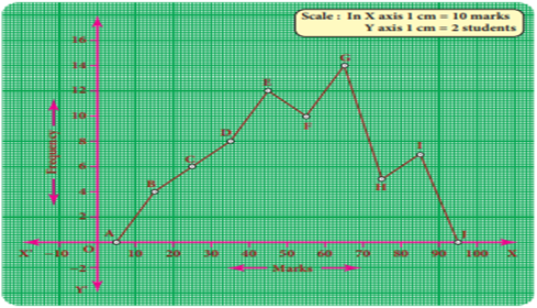
Find the midpoint of the
class intervals and tabulate it
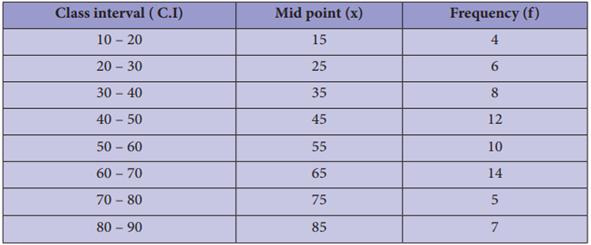
The points are (15,4) (25,6) (35,8) (45,12) (55,10) (65,14) (75,5) (85,7).
In the graph sheet, mark
the midpoints along the x- axis and the frequency along the y- axis.
We take the imagined
class as 0 – 10 at the beginning and 90 – 100 at the end ,
each with frequency ‘zero’.
From the table, plot the
points. We draw the line segments AB, BC, CD, DE, EF, FG, GH, HI, IJ to obtain the required frequency polygon ABCDEFGHIJ.
